
![]()
After a few months of hard work by both the ASI P.R., Communications and Marketing Committee and the Board, ASI is finally pleased to present the final logo, approved by its members. Voting for a new logo was done by email. 46 out of 56 ASI members responded, resulting in 96% of voters expressing a firm and honest ‘Yes’ and validation of the new design.
The new ASI logo will be officially presented during next GA in Georgia, but it has been used in the contest of the Americas in Montreal in May 2018.
ASI wanted its image to be characterized by an elegant, sober, prestigious, smart style and, to be timeless with a classic look. ASI’s identity had to be an ‘umbrella’ for many other brands (national associations, etc.), it had to encompass them. It was therefore decided to avoid the looks of a commercial brand, and to look, instead, for a ‘seal of quality’.
With inspiration from Caravaggio’s Bacchus crown, made with vine leaves, this new identity for ASI also has the shape of a circle, which is a shape that has been relevant since the beginning of time. Whether it was in religion’s use of the compass as a symbol of creation, in Leonardo’s divine proportions, in Plato’s perfect form, in Japan’s tradition of ensō hand-drawn circles symbolizing enlightenment and elegance-in astronomy and nature, and even in food and wine, the circle is omnipresent. There is something intrinsically “divine” and universal to be found in a circle that perfectly symbolizes the very nature of ASI.
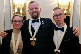
Following Latvian Raimonds Tomsons, it is now his Estonian neighbor who has claimed victory on the European stage.

On November 3, 2024, the prestigious final of the UDSF competition for the Best Sommelier of France 2024...

On September 9, 2024, Bastien Debono (head sommelier at the hotel-restaurant La Maison Bleue by Yoann Conte),